


Showing posts with label Interior Design. Show all posts
Showing posts with label Interior Design. Show all posts
Friday, April 22, 2011
Loft Interior Design in Minimalist and Modern White Themes
The white color is dominating around the floors and hightlights the shadows, the distances and the independent elements like chairs, a sofa, a table and other furniture. When you enter the home you see an open space that seeks a balance between the linearity imposed by the long, parallel main walls. The central table in structural glass (design Romolo Stanco for NIccolai), surrounded by
Friday, March 11, 2011
Living And Dining Room Combinations For Modern Urban Apartments And Houses
Living and dining room combinations are quite popular nowadays. They are especially practical for modern urban apartments and houses where space is at a premium. In this room dining and living areas are separated but a small buy roomy cabinet. You can use as a deep cabinet to get a one-side storage as a two thin cabinets to get a two-side storage. The second option is of course much more practical for such combined rooms.


Wednesday, March 9, 2011
Futuristic Interior Design Ideas | TRON Interior Design
 TRON Bathroom Designs
 TRON Home Theater Designs
 TRON Bathroom Designs
 TRON Bedroom Designs Ideas
 TRON Kitchen Design Ideas
Milan design week 2011 will happen in April and DuPont is gonna present there ‘TRON designs Corian®’. That is an exhibition of TRON inspired interiors and products designed in Corian®. movie ‘TRON: legacy’. The project is entitled Safe House and is a collaboration of various designers and manufacturers. On photos you can find a kitchen/dining area, a home theatre, and a bedroom inspired by this futuristic movie. Check them out and wait for the exhibition for more photos. Probably interiors of the future will all have designs similar to these ones [VIA].
Tuesday, March 8, 2011
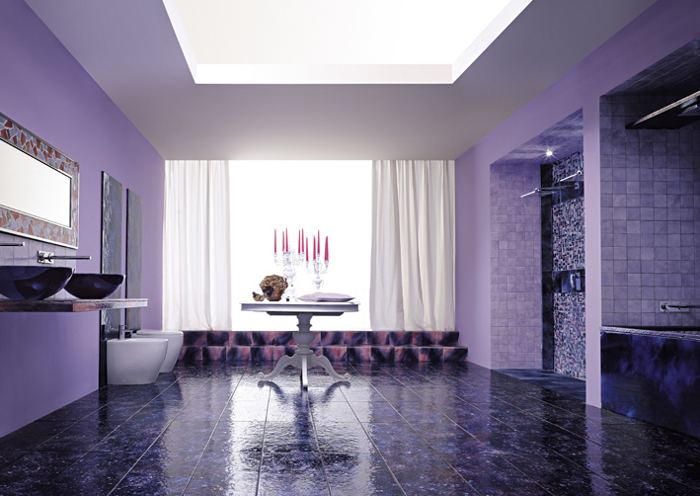
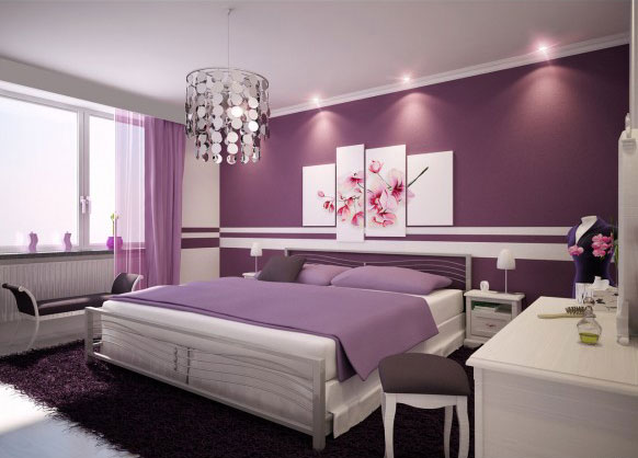
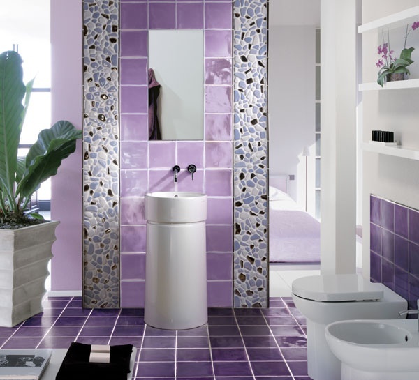
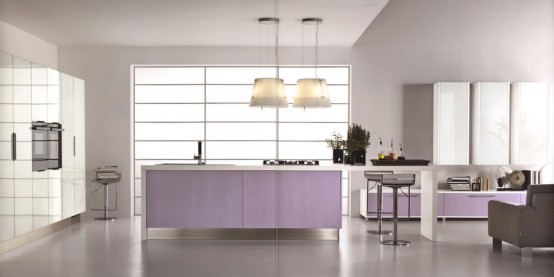
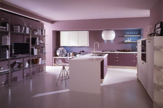
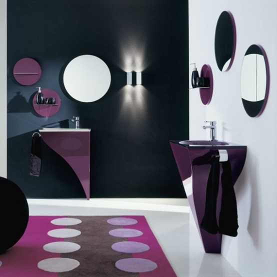
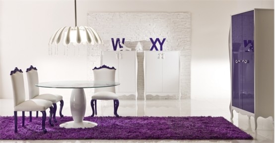
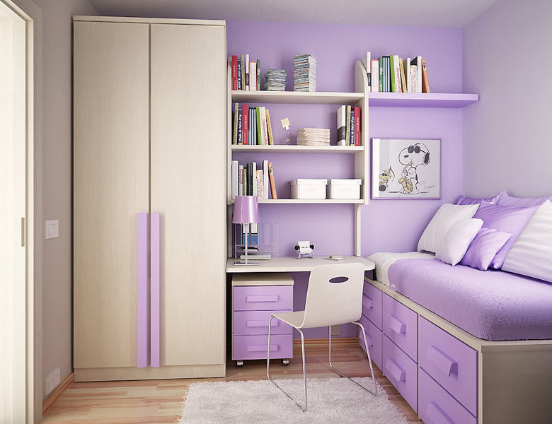
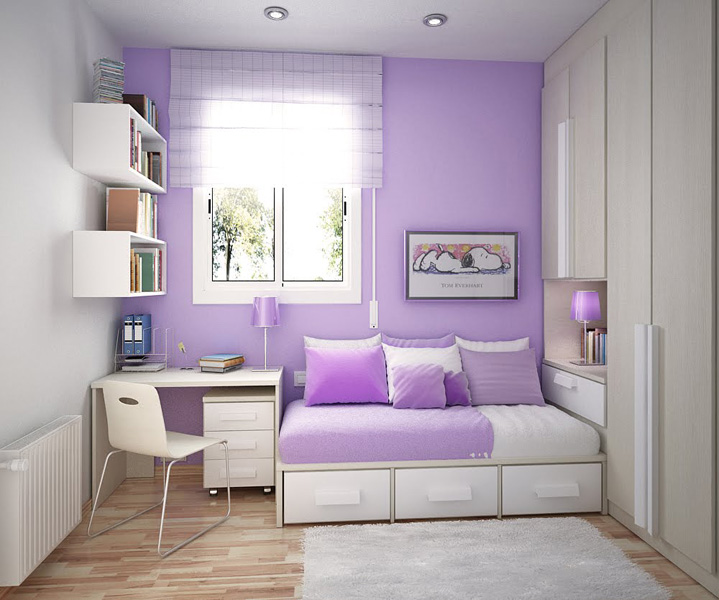
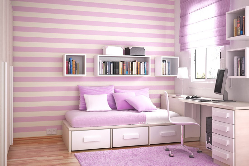
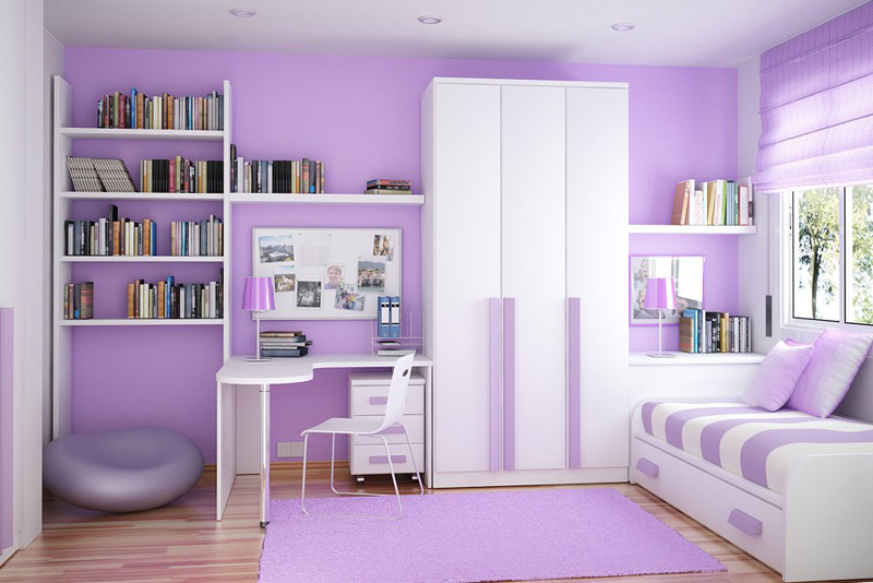
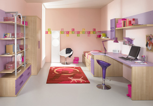
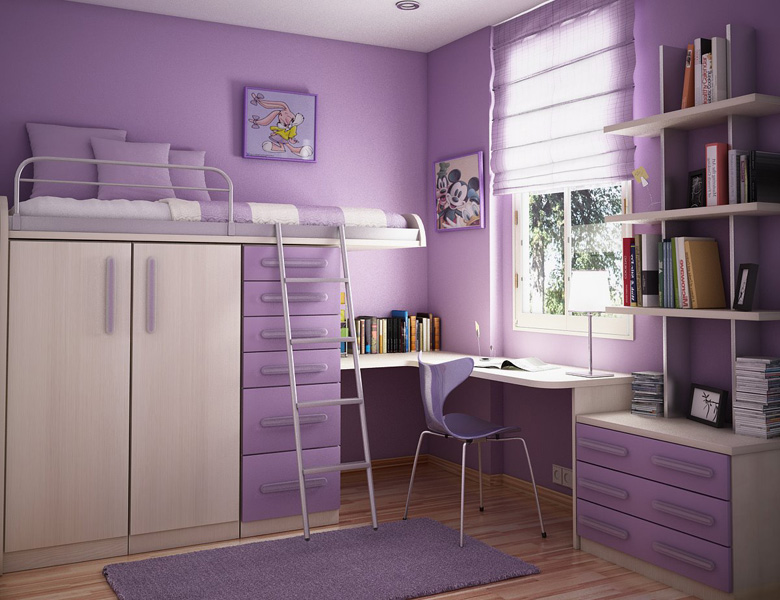
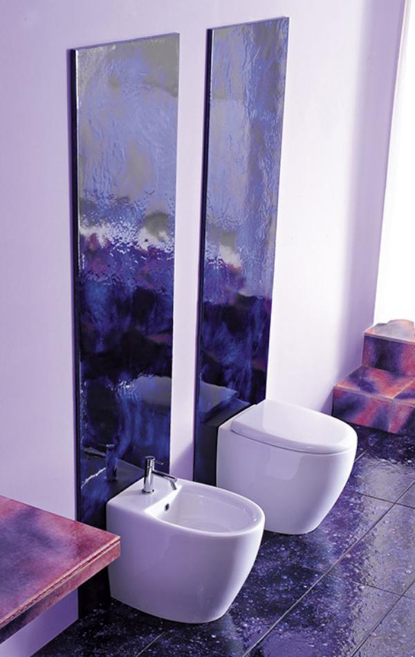
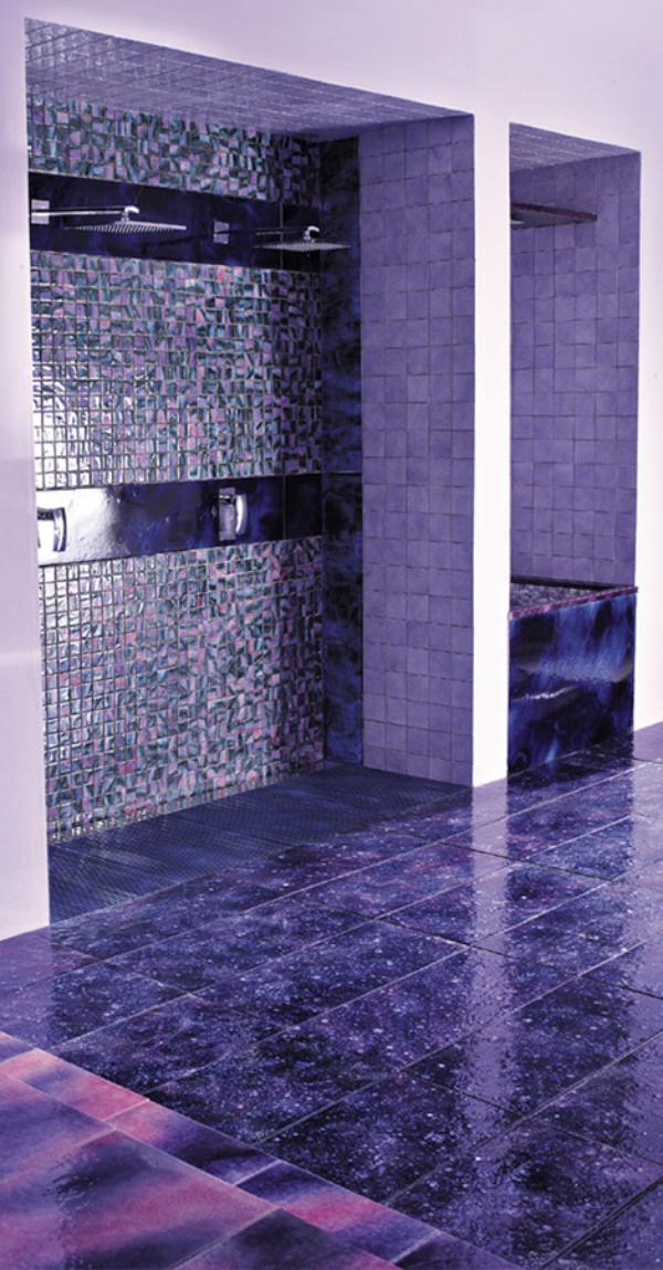
Violet Interior Design Ideas
Violet color in all its shades is a very interesting solution for an interior design, which could suit to any room. This color is adaptable for all styles. The furniture in violet color could look as very modern as delicate. It even can be glamour and splendid. For example, light violet kitchens by Cucine Lube are amazing and charming. In combination with white color they create light and very pleasant atmosphere. Although not only violet furniture is cool, but also violet bathroom tiles, which can make a stylish and very sensual interior design. This color is quite neutral, that’s why it could help you to relax in your bedroom or to add it to your kids room design. Below you could find some cool inspirations of the beautiful violet interior design.
Wednesday, March 2, 2011


Design Blogger Series: What Would You Do?
Today I am so excited to have four more talented and very crafty design bloggers participate in the fourth, Design Blogger Series: What Would You Do? Kate Riley of Centsational Girl, Stephanie of Brooklyn Limestone, Megan of Honey We’re Home, and Layla Palmer of The Lettered Cottage {all amazing DIYers} were asked to design a look around the Bailey Bench from Jayson Home & Garden by incorporating four or so home décor items of their choosing.

This chic upholstered bench with with hand-rubbed black mahogany and antique bronze nailheads is 61"W x 20.5"D x 18"H.
 {Kate’s from Centsational Girl}
"When Cristin asked me to design a room around the Bailey bench, I immediately began dreaming of a 'money is no object' serene and sophisticated bedroom space, one I would surely design just for me if I was a single gal with a large bank account! Cool grays, crisp white, soft teals, golden hues, mixed with linen fabrics and the softest patterned textiles. I love so many of these accessories, I may have to sneak some of them into my own shared master bedroom!"
Sources: Eclipse chandelier from Z Gallerie, Filmore headboard {mist} by Serena & Lily, Italian sheeting by Restoration Hardware, White lacquer nightstand from Era Interiors {pair to flank the bed}, Peacock azure pillow by Dwell Studio, Capri bottle lamp {gray} by Jonathan Adler, Circle fret rug by Dash & Albert, Devon mirror from Z Gallerie.
 {Stephanie’s from Brooklyn Limestone}
“Hi everyone - its Mrs. Limestone of Brooklyn Limestone here. As far as I'm concerned, nothing is better than imaginary shopping - all of the fun and none of the guilt!
Don't ask me why but this lovely bench made me think of Paris. And for a travel lover like me, there is nothing better than decorating around wonderful memories abroad.
I imagined a glamorous couple that has fabulous yet intimate dinner parties with the best food, wine and company. This space would be just off their impossibly gorgeous kitchen - a spacious eat in area with a French twist - perfect for reading the paper and eating croissant or throwing a fabulous fete.” The space would include lots of flicking candles on the flat surfaces and lots of black and white travel photography covering the walls.
Sources: Marble top dining table, Oversized clock from Restoration Hardware, Window treatments in Summer Palance Fret fabric, reclaimed herringbone floors, Sideboard from Wisteria, a pair of Louis XVI square back side chairs from Ballard Designs, Glass pendant lighting by Pottery Barn, Paris B&W photography by Mrs. Limestone.
 {Megan’s from Honey We’re Home}
“I started with the bed, feeling that the streamlined bedposts paired well with the legs of the beautiful bench. I then added the suzani inspired rug for a graphic punch. I’ve had my eye on those octagonal horn mirrors forever and since they are only 12 inches, thought they would look great in a pair, stacked on top of each other. The mirrored side table and chandelier brought in the glamour. Feeling Spring on the horizon, I wanted to add a bit of color with the pink pillows and tulips. The aqua patterned drapes complete the look."
Sources: Oly Studio Willa bed from Layla Grace, Tuxedo chandelier from Z Gallerie, Park mirrored dresser from Pottery Barn, Octagonal horn mirrors from Wisteria, Flower bowl by Kate Spade, Drapes by Cococozy, Throw pillows by Fabricadabra & Cococozy, Rug from Wisteria.

“The bench has sort of a "yesterday-meets-today" feel. The lines are classic, but the finishes and colors are contemporary. What a great combination! I chose a variety of items that spoke to both styles. An industrial-looking dresser from Anthropologie that says, "Hi. I'm old- but check out the big, bold graphics on my drawer fronts." A button-tufted, but boxy-shaped, charcoal-gray suede headboard from West Elm. Smooth and shiny bedside lamps, with rough and rustic shades from Pottery Barn. Crisp, white bedding (complete with little gray pinstripes) from Restoration Hardware, paired with a vintage-washed gray quilt (also RH) and colorful, and boldy-patterned, accent pillows from Luna Bazaar. And because I love the way plants bring movement and life into a room, I threw in a few mossy terra cotta pots filled with fresh greenery. :-) ”
Sources: Headboard material faux suede in charcoal herringbone from West Elm, Anthropologie Dresser, Navy & white throw pillows, White and gray bedding from Restoration Hardware, Gray quilt from Restoration Hardware, Mercury glass lamps from Pottery Barn.
A big thank you and hug to Kate, Stephanie, Megan and Layla for participating in this series!
Each design is gorgeous in my book. Which one catches your eye?

Monday, February 28, 2011
Color Psychology in Interior Design by Guest Blogger Michaela Noelle
While I am in LA attending the Design Bloggers Conference, Michaela of Michaela Noelle Designs will be filling in for me. As you will see from her blog, Michaela is a darling young design student with a great eye for design and fabulous sense of style. She is currently living her dream of becoming a designer. Love it. And I love the advice her grandmother gave her,
 “Dream big. Don't stop at dreaming though; make those dreams come true by working hard with determination and integrity. Learn all you can so you can be great at what you do. But most of all, do what you love and do it with passion.”
Michaela, thanks again for guest blogging. Keep on dreaming - Your future is bright! ~ Cristin
Hi all! I'm Michaela from Michaela Noelle Designs, and I can't tell you how excited I am to be here at Simplified Bee today! I'm an interior design major at Seattle Pacific University and I am totally, head-over-heels, in love with all things design. Originally from California, I'm still trying to adapt to the rain {and all those looks I get when I pull out my Coach umbrella}. I have a special love for the home and what it means to a person and a family. My passion in life is to serve others, and my joy comes from doing so through interior design.
While school is definitely challenging and time consuming, I feel lucky that I'm learning to do something I'm passionate about. Sometimes, I can't believe I'm drawing a furniture plan for homework! I used to draw floor plans on my kids' menus when we'd go out to eat when I was younger. You know... where most kids would play tic-tac-toe or draw their pet, I would be sketching my dream house. My mom even made sure to tell me not to draw any floor plans at dinner before I left for my first date! I guess she was right. That could have been awkward. (:
Today, I'm going to share some insight on one of my favorite topics: color psychology. Color is such a huge part of our lives! Your mood can directly affect your actions; the color shirt you choose to wear in the morning, the can of paint you decide to redo your family room in, and what color you pick out for your latest manicure. It also works the opposite way, as colors have the ability to make you feel a certain way. Let's start from the beginning, shall we?
The color wheel:

The hues on the left side of the color wheel are all considered "cool colors" which will make walls recede, or make a room appear bigger, while the right side of the wheel is deemed the "warm colors" which, in turn, make walls or a room advance.
The Joyful Energizer: Yellow

Yellow is refreshing. It adds life to any room, rejuvenating the soul. The pure and bright characteristics of the hue offer energy and happiness. Last year, we discovered that painting a nursery a bright tone of yellow may cause the baby to be too awake and energetic, therefore causing more crying. Silly, but it could be true! Yellow is the brightest color on the color wheel, so your eye will be immediately drawn to something yellow, even if it's surrounded by multiple other colors.
The Bold Show Stopper: Red

Did you know it's actually proven that when a person walks into a room of red, their heart rate will automatically increase? It gets your blood pumping. Red is the absolute most appetizing color. So serving food on red plates or eating in a room with red walls or accents will actually make someone more hungry {and perhaps enjoy your cooking even more!} Sarah Richardson nailed this dining area with punches of red, warming up the space, while the accents of blue anchor the room. Because red is such a bold color, white or neutral walls with red accents is a great way to introduce the color. It's a show stopper. (:

Purple might be is most definitely my favorite color on the color wheel. Sitting directly opposite of yellow, purple is the perfect color for peacefulness. Since it's character foil is yellow, which personifies energy and makes you want to go-go-go, peace and serenity is only fitting for the personality of purple. It exudes confidence, creativity, and passion. It is also the color of royalty, and who doesn't love feeling like a princess?
The Tranquil Get-Away: Blue

Reminding us of the sea, sky, and rushing rivers, blue will soothe our souls. Because it is a "cool color", it makes walls recede, creating the allusion of a bigger space. The first picture shows how just a subtle sky blue paint can warm up the space, giving depth to the room. The second picture is the perfect example of how to add drama to a space with wonderful architectural features, like the molding. This dark blue adds a dash of formality to a casual family room. Want to know a secret? Blue is the most unappetizing color. In fact, if you ever go to a salad bar or buffet table, a lot of the time the restaurant will strategically give you blue plates. You'll automatically take less food, because you're not as hungry just by looking at the plate! Crafty folks, eh?

Green is the color of nature. It brings the outdoors in, which is always nice, isn't it? Green is said to bring new life and a sense of freshness to a space. Being on the cool side of the color wheel, it is also a tranquil color. In other avenues of life, we attribute green with money, health, and jealousy. In the home though, it often tends to have a calming effect, much like purple and blue. Did you know guests on TV shows wait in "green rooms" intentionally, so they can de-stress before their appearances? I love how designer Tobi Fairley is bold in her color choice, but not in the expected fashion of the walls. This is a great example of how to make a statement with pieces in the room, not necessarily your wall color. It's a wonderful choice for renters who don't have the option of painting!
The Understated Grace: Neutrals

Just because you chose neutral paint, furniture and accessories doesn't mean you have no personality! You have quite a distinct one, actually. Neutral colors are said to be relaxing, soft, plush, pleasant, graceful, and have a sense of understated elegance. White couches and rugs also say "I'm bold, daring, and luxurious enough to own something white." I happen to be very drawn to neutral spaces, with perhaps a touch of color in the rug, pillows, or flowers. One tip- when trying to achieve this look, be sure to include more texture in your space. Texture is what makes neutral rooms shine, as seen in the beautiful fireplace above!

For today's sake, we are calling black a color (even though it is technically the absence of color, but obviously that's no fun!). "Every room needs a touch of black"...I remember hearing this on HGTV once, and I really like the saying. Black anchors a room, and it's another bold choice when used on walls and in cabinetry, as seen above. It's the color of mystery and sophistication. Black is commonly seen paired with a contrasting color. Putting any color against black will consequently make the other color appear brighter. In both photos above, you can see how even though there is black in the spaces, they are still ever so lovely and glamorous when paired with textures, complimenting patterns and lighter colors to balance the black.
Thank you so much, Cristin, for having me share some insight from my classes in design school. You're the sweetest and I can't wait to meet you in person someday!
And readers, it's been fun! I hope this post has brightened your knowledge on color as much as it brightened my day to bring it to you. (:
~Michaela
Friday, February 25, 2011
Yes or No to Carrara Marble Countertops in the Kitchen?

Carrara marble. Quarried in the Italian province of Carrara, this gorgeous stone is used to make tiles, tabletops and countertops in homes around the world. Carrara marble is becoming more and more popular in all-white kitchens like this one by trend-setter designer, Jonathan Adler.

Carrara marble, like other marbles is porous. Because of its light color it is more likely to show stains than other marbles and stones. It also needs regular care in order to maintain its beautiful surface. In addition, cleaning Carrara and other types of marble must be done properly with a pH-balanced stone cleaner. To learn more about cleaning marble, go here.

We love the look, but is the maintenance worth it? I ask the question because a client of mine {with three young ones} is considering Carrara marble countertops in her kitchen and has received strong advice both for and against. I’d love to hear from designers and home owners who have experience using Carrara marble countertops in the kitchen… thumbs up or down?
It's also not too late to enter to win a $50 gift certificate to fab stationary store, Minted.com - go here.
It's also not too late to enter to win a $50 gift certificate to fab stationary store, Minted.com - go here.
{image sources: 1. Jonathan Adler, 2. James Radin, 3. William Diamond and Anthony Baratta - all via House Beautiful}
Subscribe to:
Posts (Atom)


